Chicago Sports Dashboard: From a City-Wide Concept to a Bears-First System
Why this matters: A practical demonstration of designing and building a real-time, data-driven product. It shows how I handle messy external data, UX consistency, system constraints, and progressive delivery without sacrificing readability.
Team Composition
(Solo Project)Independent work with periodic peer feedback on layout clarity, interaction design, and data readability
TL;DR: Building a TMS Platform from the Ground Up
Scope:
Designed and built a Chicago sports dashboard concept that began as a multi-team selector experience, then intentionally narrowed to a Bears-first dashboard to establish reusable patterns, validate data structures, and reduce scope risk.
Approach:
Started with a city-wide concept and a CSS-driven team selection UI. Real data inconsistencies across leagues forced a strategic pivot to one team so I could design a stable template, identify data gaps, and evolve the UI toward readable, story-driven season context.
What I did:
Solo ownership across UX strategy, information architecture, UI design, component architecture, API integration, caching strategy, error states, and deployment.
Impact:
Converted a visually slick concept into a functional sports product foundation with stable layout patterns, resilient data handling, and a clearer narrative flow from season overview to deeper team context.
Project Overview
The Challenge
The initial goal was to reflect the Chicago sports scene with a unified dashboard experience. The first designs focused on interaction and presentation, but real sports data is inconsistent across leagues and teams. That mismatch made the earliest city-wide dashboard feel incomplete and unstable.
- ⚠️A consistent UI template breaks down when each sport exposes different stats and structures
- ⚠️Early design prioritized slick selection behavior over long-term data readability
- ⚠️Cross-team scope introduced complexity before a stable component and data model existed
- ⚠️The season overview cards felt too minimal to explain context or guide users through the page
- ⚠️Desktop layouts felt underutilized and mobile layouts felt overly spacious without added meaning
Project Goals
Build a dashboard that feels Chicago in spirit, but is useful in practice. The interface should be data-forward, readable, and designed around what the data can reliably support.
- 🎯Create a team selection experience that feels modern and fast
- 🎯Establish a consistent dashboard template that can scale across teams over time
- 🎯Make the UI data-forward without becoming dense or hard to scan
- 🎯Design resilient data handling including caching and clear error states
- 🎯Create a narrative flow so the page feels like a season snapshot, not a scoreboard
My Role & Responsibilities
UX Research & Design
- • Defined what “at-a-glance” means for a fan scanning a season
- • Identified which stats communicate story versus noise
- • Reviewed how sports products structure season context (overview, schedule, team stats, roster)
- • Validated layout and hierarchy through iterative implementation in code
Frontend Development
- • Built a Next.js + TypeScript feature architecture for team dashboards
- • Integrated ESPN API endpoints and normalized inconsistent fields into a stable UI model
- • Implemented local caching for resilience when fetches fail
- • Built reusable card components for overview, stats, schedule, and roster
- • Created status handling for live, cached, and partial data load scenarios
Cross-functional Collaboration
- • Solo project with lightweight milestone planning and scope control
- • Used iterative shipping to avoid waiting for a perfect “all teams” version
- • Collected informal peer review on readability and information density
Development Approach
This project started as a design-forward city concept, then evolved into a system-building exercise. The key shift was designing around real data constraints and building a foundation that can scale across sports over time.
Technology Stack
Frontend
- • Next.js 15 with React for routing and component architecture
- • TypeScript for strict typing and predictable data contracts
- • Tailwind CSS v4 for consistent UI patterns and rapid iteration
- • UI cards and data density patterns tuned for scanning
Backend Integration
- • ESPN public APIs for team data, schedules, and stats
- • Caching for fallback states when live calls fail
- • Status modeling for live vs cached vs partial loads
Design Principles
- • Consistency is earned through normalization, not forced through visuals
- • Readable beats flashy when data is the product
- • Progressively reveal complexity from overview to details
- • Use layout density intentionally, especially on desktop
- • Error states are part of the UI, not an edge case
Research & Discovery
Why I Started the Dashboard Concept
The original goal was to build something that reflects the Chicago sports scene. It started as a drawer-based selector concept, but quickly turned into a bigger question: once a user picks a team, what is the best way to show meaningful season context immediately?
The Early Interaction Idea
The drawer was the initial design hook. It felt slick and lightweight, and I wanted to see how far I could push the UI with CSS-first thinking.
The Idea Expanded
As soon as I considered what should be inside the experience after selecting a team, it became a dashboard problem, not just a selection problem.
What Felt Wrong or Incomplete
I originally wanted a dashboard where all teams looked similar and followed the same template. Once I started mapping real data across teams and leagues, the idea broke down.
Inconsistent Data Across Teams
The information available was different for each team and sport, and I could not keep the experience consistent without either hiding important stats or forcing irrelevant ones.
Scope Was Too Big Too Early
Trying to solve all Chicago teams at once made the project feel unbounded and made it hard to lock in any stable template decisions.
The First Intentional Shift
I narrowed the scope to a single Bears dashboard. This was the first systems-focused decision and it unlocked progress.
Template First, Then Scale
If I could build one complete dashboard, I could prove the layout, sections, and data model before attempting to scale across teams.
Data-Forward, Less Flash
I intentionally moved away from flashy interaction being the core value and shifted toward a readable, data-forward layout that feels useful.
Less Overwhelm, More Iteration
Working on one team made it easier to see data management issues and design issues without drowning in cross-team complexity.
After the Season Overview Cards, What Still Bothered Me
Even when the Season Overview cards worked, they did not tell a complete story. They provided outcomes, not context, and the page lacked narrative flow.
Density and Spacing Problems
On desktop it felt too minimal and on mobile it felt too spacious. There was too much room not to communicate more meaning.
Missing Flow
I wanted a natural progression from overview to schedule to stats and roster. I did not want a dashboard that felt like a scoreboard with extra boxes.
I Wanted the UI to Do Some Thinking
The next iteration needed to guide the user and communicate season context, not just list numbers.
Design Process
The dashboard evolved through implementation-driven design. Each iteration revealed data constraints, layout issues, and opportunities to improve narrative flow.
City-Wide Concept and Team Selection
Started with a Chicago-first dashboard entry experience focused on team selection. Explored a CSS-forward approach for interaction polish.
Reality Check: Data Consistency Breaks
Mapped real sports data across teams and leagues. Discovered structural inconsistencies that prevented a single shared template from working cleanly.
Scope Pivot: Bears-First Dashboard
Reduced scope intentionally to create one complete dashboard and use it as the foundation for reusable patterns.
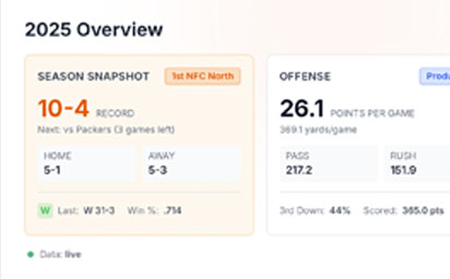
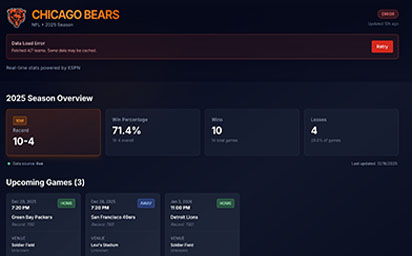
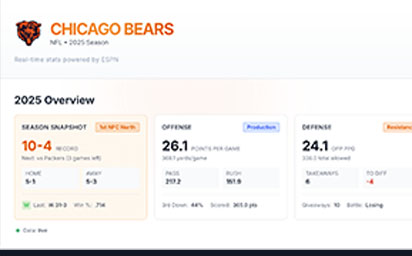
Season Overview Baseline
Established the first stable UI pattern with Season Overview cards. Record and win metrics created a clear entry point.
Story and Flow Improvements
Focused on density, layout flow, and making stats more contextual. Began adding sections that progress from overview into deeper team understanding.
The Solution
The solution is a Bears-first dashboard that establishes a scalable template while acknowledging real data constraints. It prioritizes readability, narrative flow, and resilient loading behavior.
A compact at-a-glance summary (record, win rate, wins, losses) that establishes immediate season context and anchors the page.
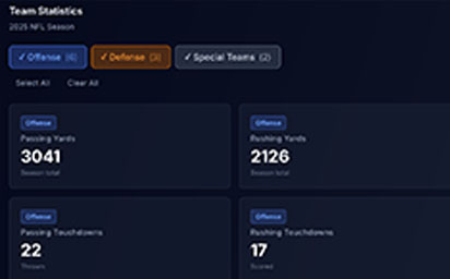
Stats organized into offense, defense, and special teams to reduce cognitive load and let users control data density.
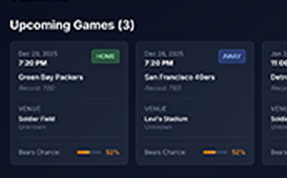
Upcoming games presented with location, broadcast context, and a consistent card structure that reads cleanly on dark UI.
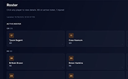
Roster list supports quick scanning, while a player detail panel provides core identity and a clear exit to authoritative sources when deeper stats are not available.
Clear system feedback when data is cached, partially loaded, or unavailable. Error states are presented as UI, not hidden failures.
Product and UX Improvements
- ✓Shifted from a city-wide concept to a stable single-team template
- ✓Replaced interaction-first thinking with data readability and structure
- ✓Introduced narrative flow from overview into deeper context sections
- ✓Improved density so desktop space is used intentionally
- ✓Made system states visible (live, cached, partial load, error)
Technical Improvements
- ✓Normalized inconsistent ESPN fields into a stable UI model
- ✓Strict TypeScript typing to prevent silent data mismatches
- ✓Caching to reduce failures and improve perceived reliability
- ✓Component patterns designed to scale to other teams later
- ✓UI-level error handling with retry support
Before/After Comparison
From Chicago-Wide Concept to Bears-First System
Results & Impact
This is a personal build, so results are measured by stability, clarity, and system maturity rather than business KPIs. The main outcome is a foundation that can scale without collapsing under inconsistent data.
Business Outcomes
User Feedback
"This feels like more than a stats page. The layout makes it easy to understand the season quickly."
— Peer Feedback, Design colleague
"The error and cached states are a nice touch. It feels like a real product, not a demo."
— Peer Feedback, Engineering colleague
Long-Term Value
Based on the performance improvements and business impacts, the project achieved a positive return on investment. The long-term benefits include:
Scalable Template
A repeatable dashboard structure that can be adapted across teams and sports without restarting design from scratch.
Data Constraint Practice
A real example of building UI around imperfect external data, including fallback strategies.
Portfolio Credibility
A functional product feature that demonstrates both UX judgment and frontend execution.
Reflections & Lessons Learned
This project reinforced that good dashboards are not about showing more data. They are about making data readable, trustworthy, and structured in a way that tells a story.
What Worked Well
✓The Bears-First Pivot
Reducing scope was the difference between an idea and a system. It made progress measurable and template decisions real.
✓Data-Forward Layout Decisions
Once I treated the data as the product, the UI became clearer. The design gained purpose and the dashboard felt more mature.
✓Explicit UI States
Treating caching and errors as first-class UX improved trust and made the experience feel more product-like.
Challenges & Takeaways
⚠Cross-League Consistency
Different sports expose different stats and structures. Achieving consistency requires normalization, not visual sameness.
⚠Telling a Complete Story
The season overview cards were necessary but not sufficient. The harder work was shaping flow and context.
⚠Scope Control
Even within one team, it is easy to expand endlessly. I had to keep shipping in stages.
Key Takeaways
This project highlighted several principles that I now apply to all of my UX work:
Consistency Depends on Data Contracts
Dashboards feel consistent when the data model is consistent. UI polish cannot compensate for mismatched structures.
Readable Beats Dense
A good sports dashboard helps you understand the season quickly. It should not force you to work to interpret it.
Flow Creates Meaning
The difference between a dashboard and a stats list is narrative flow. The page needs to guide the user from summary into context.
Interested in working together?
I'm always open to discussing new projects, creative collaborations, or opportunities to be part of something meaningful. Feel free to reach out if you'd like to discuss how my skills and experience could benefit your team or project.