Designing a Scalable, User-Centered TMS from the Ground Up
Why this matters: Demonstrates building enterprise-scale systems from scratch for 250+ users, with full design system ownership and cross-functional leadership.
Team Composition
(8-12 members)Hybrid team with daily standups across Eastern and Central time zones
TL;DR: Building a TMS Platform from the Ground Up
Scope:
Designed and helped build a new Transportation Management System (TMS) to replace outdated tools and streamline operations across multiple departments.
Approach:
Blended field research, event storming, and ongoing user feedback with iterative design, component development, and cross-functional collaboration.
What I did:
Led UX design, created and evolved the component library, supported frontend development with LiveView and Tailwind, and worked closely with engineers and product to ship usable, scalable features.
Impact:
Helped improve user satisfaction, reduce onboarding time, and modernize how teams handle freight, exceptions, and data entry in day-to-day operations.
Project Overview
The Challenge
NFI Industries needed to replace a collection of aging tools with a cohesive TMS that could scale. The companys 18,000+ employees (drivers, dispatchers, ops) relied on legacy systems and manual workarounds.
- ⚠️Replace multiple disparate legacy systems
- ⚠️Support complex multi-modal workflows (LTL, dedicated, intermodal, freight, intermodal, and final mile operations)
- ⚠️Deliver clearer visibility into critical operational data
- ⚠️Design for scalability as the user base and business needs evolve
Project Goals
I worked closely with developers, business stakeholders, and product managers to create a platform that balanced technical capabilities with usability. Our north star was to streamline brokers and drivers, speed up exception handling, and give new teams instant entry with onboarding and day-to-day operations.
- 🎯Design a cohesive UI to enforce visual and interaction consistency
- 🎯Build reusable UI foundation for future expansion
- 🎯Create a flexible kit foundation for future expansion
- 🎯Support faster iteration and feedback cycles with developers
My Role & Responsibilities
UX Research & Design
- • User interviews & contextual inquiry
- • Event storming workshops
- • User interviews and documented journey across internal roles
- • Analysis of workflows across dispatchers, brokerage, and ops to inform final mile operations
- • Wireframing, prototyping, and usability testing
- • Partnering with stakeholders to align design with business logic
Frontend Development
- • Developed reusable UI components in Phoenix LiveView
- • Implemented scalable design system with CSS
- • Ensured accessibility and responsive design across real
- • Maintained design system documentation for cross-team use
Cross-functional Collaboration
- • Worked daily with backend developers to implement Elixir-based logic
- • Facilitated iterative planning sessions with product managers
- • Provided designer-dev bridge between engineering and business teams
- • Contributed to long-term product planning and vision scoping
Development Approach
This wasn't a traditional redesign; we built the TMS platform from the ground up. Our goal was to create a modern, scalable foundation that could grow with the business. I focused on balancing thoughtful UX alignment with pragmatic, user-centric approach that allowed for rapid feedback, convenient interfaces, and close alignment with backend logic in Phoenix and Elixir.
Technology Stack
Frontend
- • Phoenix LiveView for reactive, server-driven UIs
- • Tailwind CSS for scalable, utility-first styling
- • Alpine.js (where needed) for client-side enhancements
Backend Integration
- • Real-time updates using Phoenix Channels
- • Elixir OTP for fault-tolerant backend services
- • Optimized queries and schema design for high-volume data
- • PostgreSQL for database with strong frontend and backend alignment for consistency
Design Principles
- • Modular UI from Day One: Built a modular system from day one, enabling maintainability, coherence, and quick iteration in both design and code.
- • Performance by Default: Optimized for fast rendering and minimal DOM re-renders with LiveView. Designed workflows to reduce clicks and page transitions.
- • Progressive Disclosure: Surfaced only what users needed, when they needed it. Prevented visual overwhelm through incremental reveals.
- • Collaboration-Ready: Wrote component-level documentation with other engineers, streamlining handoff, enabling faster onboarding, and easier handoff between teams.
Research & Discovery
Understanding the Logistics Landscape
Discovery for this project was ongoing, often embedded directly into our collaborative work sessions, event storming, and site visits. While we didn't follow a formal research schedule, our iterative process constantly gathered insights from internal users and stakeholders, shaping the product through conversation, observation, and shared domain knowledge.
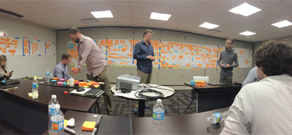
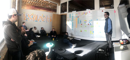
Event Storming as a Shared Tool
Event storming was particularly powerful. I used event storming to help the team understand the project as a collaborative way to understand workflows, align across teams, and identify edge cases that would become real feature improvements. My first session was in Cherry Hill, NJ on my second day at the company. We worked with developers, product owners, and the department manager to map out key workflows and operational pain points. This was a regular part of our discovery process, especially when starting new initiatives or working through domain-specific problems.
User Interviews Across Teams
Over time, I spoke with dozens of users across roles including account managers, operations staff, and regional brokers. Some sessions happened during design discussions or feature reviews. Recurring pain points included the rigidity of legacy systems and the amount of workarounds users relied on to complete tasks, which pushed us to design more toward more flexible, context-aware interfaces.
Discovery as a Long-Term Practice
This wasn't a one-time research phase. As the product evolved, so did our understanding of how it needed to work. Iterations often integrated work objects across screens to isolate responsibilities. But over time, feedback showed users needed to see and act on everything within a single, unified view. This led to more contextual changes in how we organized interfaces, moving toward consolidated screens where related context and actions.
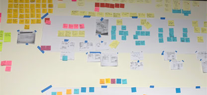
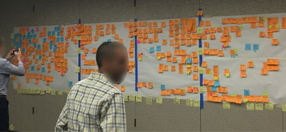
Artifacts & Visual Thinking
Visual thinking played a big role throughout the project. We used wall-sized sticky note boards, Kanban tracking, and physical whiteboards to stay aligned. These tools helped surface friction points, connect technical and business goals, and ground our design conversations in real workflows.
Design Process
My design process at NFI was grounded in understanding — of the users, the business goals, and the technical realities. Whether we were tackling a live feature, iterating on a live feature, I worked closely with product, engineering, and users to surface the root problem and build toward a solution that was feasible, scalable, and usable.
Collaborative Discovery & Ideation
Design work typically began with either a kickoff session or an event storm, depending on the scope. These meetings gave us a baseline. We'd team align on what the problem was and how it affected user workflows. From there, we often ran "crazy eights" sketching exercises to quickly generate ideas and test concepts on paper. It was an effective way to exhaust assumptions early and invite visual thinking before we touched tools like Figma or Miro.
Wireframes & Explorations
We used a mix of Sketch (early on) and Figma (eventually) for wireframing. I created low-to mid-fidelity explorations that visualized user flows and key interactions. These weren't always linear. Logistics workflows are notoriously messy, so we aimed to prototype features, like a core idea at first iteration. In many cases, a single screen could have seemed simple at first blush, but ended up requiring business rules, workflows, and backend constraints, requiring multiple iterations to account for business rules, workflows, and backend constraints.
Iteration Through Feedback
Feedback played a central role in shaping design direction. Product managers were our primary channel to user feedback, but we also received feedback directly from users and engineering leads. Regular design reviews allowed teammates to ask questions and point out missing use cases. Often, the act of visualizing a flow exposed things we hadn't accounted for.
Component System Development
Our design system evolved alongside the product. Early on, it was a fast-moving collection of styles and atomic patterns. As we scaled and reused patterns across more stable set of components, I often iterated components directly in LiveView — meaning we worked out the components. I often iterated components directly in LiveView — meaning we tested components, many of which were tested across the platform to ensure consistency but depending on the context, some patterns moved straight from paper sketches to code. We eventually laid out documentation and organized components alongside reusable functions and reduce implementation time.
Working Side-by-Side with Developers
I worked closely with the development team on implementation, reviewing pull requests and occasionally building features directly in LiveView. My involvement depended on the complexity of the feature. Being part of the build process gave me insight into how backend logic and data structures influenced design, which helped prevent unrealistic handoffs. When needed, we discussed constraints or alternatives together, which, looking back, made the process feel less like handing off a design and more like co-creating it together.
The Solution
Our final solution addressed user frustrations around fragmentation, redundancy, and outdated interfaces. We designed a system that prioritized visibility, responsiveness, and task continuity—empowering dispatchers and managers to work faster, with fewer clicks and clearer information. Below are key areas where the interface and workflow made the biggest impact:
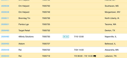
This dashboard brought shipment data, load statistics, exceptions, and recent activity into a single view. Instead of jumping between multiple apps and tools, users could now access the information they needed at a glance, using priority-based filters to cut through noise and focus on what mattered most.
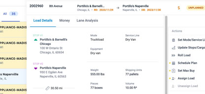
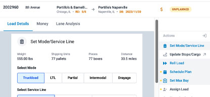
Shipment details, actions, documents, and messaging were redesigned to live in one place. Previously, users had to switch contexts between screens or panels to complete a task. With the new layout, they could manage everything about a shipment — tracking, messaging, and planning — from one unified, continuous interface.
Exceptions were previously tracked manually, often lost in context, or buried in outdated tools. We built a categorized exception panel with built-in logic and resolution tools. Users could now identify, categorize, and resolve issues quickly without losing context or relying on offline notes.
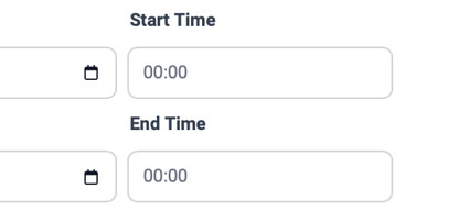
One of the more complex areas was time entry. We simplified entry by creating guided flows that didn't require nuanced rules and conditions across departments. We created guided input flows that accounted for regional differences, validation rules, and multi-leg shipments — reducing user errors and saving time.
Key UI Shifts
- ✓Shifted from tab-based UIs to task-based views
- ✓Replaced redundant fields with smarter defaults and contextual UI
- ✓Embedded status logic, so users didn't have to guess what came next
Team Collaboration Improvements
- ✓Enabled server-side visibility across dispatchers and exception handling
- ✓Integrated real-time, in-line comments and shared task indicators
- ✓Created back-and-forth messaging across departments
Result
- ✓These changes laid the foundation for a faster, more consistent user experience. Teams could do more from fewer screens, reducing cognitive load and increasing the system's accuracy and responsiveness.
Results & Impact
After rollout of the new TMS interface, we tracked improvements across onboarding, task speed, and user satisfaction. These results were based on internal reporting, user feedback, and operational data shared by product leads and department managers.
Business Outcomes
User Feedback
"The new system definitely cuts down on the back-and-forth, but some of the newer workflows still take time to get used to."
— L.R., Operations Lead
"We're moving faster on daily tasks, though I'd like to see more options for customizing views by role."
— J.P., Fleet Manager
Long-Term Value
Based on the performance improvements and business impacts, the project achieved a positive return on investment. The long-term benefits include:
Scalability
The component-based UI and LiveView architecture allow for fast feature expansion and design consistency across teams.
Operational Efficiency
By reducing manual work and streamlining workflows, the platform helped improve delivery accuracy and team coordination.
Design & Dev Alignment
Designers and engineers now work from a shared component system, improving delivery time and reducing rework.
Reflections & Lessons Learned
Working on the TMS platform wasn't just a long-term project — it was a long-term education. This experience challenged me to grow as a designer, collaborator, and developer. It gave me the opportunity to shift from supporting workflows to shaping them, and from executing UI to helping architect the system behind it.
What Worked Well
✓Ongoing User Engagement
Spending time with real users in the field helped us design based on how things actually worked, not just what we thought we might have missed in formal requirements.
✓Event Storming for Shared Understanding
These collaborative sessions became a consistent tool for aligning teams on goals, workflows, and assumptions early in the process.
✓Component-First Design Thinking
Building a living component system made the platform more maintainable, easier to test, and able to scale across different use cases.
Challenges & Takeaways
⚠Designing for Complexity
Many logistics workflows aren't linear. Balancing simplicity with power required iteration, progressive disclosure, and a lot of internal feedback.
⚠Documentation Gaps
In the early days, some design decisions were tribal knowledge. Over time I learned the importance of documenting not just what we built, but why.
⚠Balancing Design & Dev Work
As both a designer and LiveView developer, I had to constantly balance fidelity with feasibility — and I learned how much clarity helps both sides move faster.
Key Takeaways
This project highlighted several principles that I now apply to all of my UX work:
Context is Everything
Every team, tool, and workflow has a reason behind it. Design that honors that context isn't just more usable, it's more likely to be adopted and improved upon.
Design as a System
A good UI solves problems. A good design system prevents them. Thinking in components early helped our team scale fast without losing consistency.
Iteration Over Assumption
The best ideas often emerged after the third or fourth version. I've learned not to get too attached to my first solution, and to leave room for surprises in the process.
Interested in working together?
I'm always open to discussing new projects, creative collaborations, or opportunities to be part of something meaningful. Feel free to reach out if you'd like to discuss how my skills and experience could benefit your team or project.