A Decade of Growth: Redesigning My Portfolio from Whimsy to Purpose
Why this matters: Showcases the evolution of my design philosophy and technical skills over a decade, transitioning from a visually playful portfolio to a mature, research-driven UX and frontend development platform.
Team Composition
(Solo Project)Independent work with periodic peer reviews from design and development colleagues
TL;DR: Building a TMS Platform from the Ground Up
Scope:
Complete rebuild of my original 2014 HTML portfolio into a modern React and Next.js application that better reflects my evolution from visual designer to UX practitioner with a Master of Science in HCI.
Approach:
Started with a modernization of the existing HTML, then shifted to React once the site required scalable components, reusable templates, and dynamic content. I researched current personal site frameworks and analyzed portfolios of senior designers to benchmark professional standards.
What I did:
Solo project covering UX strategy, information architecture, design, frontend development, API integration, and full deployment responsibilities.
Impact:
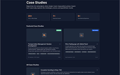
Transformed a single-page visual showcase into a multi-layered professional platform with full case studies, a blog, contextual skill presentation, and a working Chicago Sports Dashboard that displays live data.
Project Overview
The Challenge
My 2014 portfolio had served me well, but it no longer represented my experience or design philosophy. The emoji-heavy aesthetic fit my early design years, but not my current focus on research-driven UX and scalable design systems. After completing my HCI degree and years of designing enterprise tools, I needed a site that communicates design depth, technical expertise, and professional maturity.
- ⚠️Visual language that signaled junior designer rather than established UX professional
- ⚠️Single-page structure with no capacity for long-form case studies or cross-linked content
- ⚠️Static HTML with no path to dynamic features or scalable architecture
- ⚠️Skill percentages that implied superficial ability rather than concrete experience
- ⚠️No meaningful demonstration of technical problem solving or implementation ability
- ⚠️Missing narrative that explains how I work, why I make certain decisions, and how I think
Project Goals
Build a portfolio that communicates who I am today: a designer with a strong technical foundation, a focus on design reasoning, and an ability to think and build at scale.
- 🎯Create a modern and professional visual identity that signals UX maturity
- 🎯Build a scalable architecture that supports deep content and future expansion
- 🎯Show technical capability through the site itself
- 🎯Leverage reusable components and structured content objects
- 🎯Include authentic personal context that adds dimension without weakening professionalism
- 🎯Make updates and future publishing fast and frictionless
My Role & Responsibilities
UX Research & Design
- • Reviewed current portfolios of senior designers and design leaders
- • Evaluated frameworks for personal site development
- • Audited the existing site against my current positioning
- • Planned information architecture for a multi-page, content-rich structure
- • Established content goals for case studies and blogs
Frontend Development
- • Architected a Next.js 15 application with TypeScript
- • Developed a reusable component library with predictable behavior
- • Implemented Tailwind CSS v4 with semantic color grouping and dark/light modes
- • Integrated the ESPN API for live Chicago sports data
- • Deployed using automated static generation on IONOS Deploy Now
Cross-functional Collaboration
- • Self-directed project with milestone tracking and scope control
- • Used GitHub for version control and deployment
- • Created sustainable workflows for writing and publishing content
- • Iterated based on reflection and peer review
Development Approach
This project started as a simple HTML cleanup and soon required a full technical pivot. Adding case studies, robust navigation, data-driven components, and a blog system revealed the limits of static HTML. Next.js provided the flexibility and scalability the site needed.
Technology Stack
Frontend
- • Next.js 15 with React 19 for modern application architecture
- • TypeScript for strong typing and long term reliability
- • Tailwind CSS v4 for utility-first styling and consistent design expression
- • Framer Motion for purposeful motion elements
- • Recharts for structured data visualization
Backend Integration
- • Static site generation for fast performance and caching
- • ESPN public APIs for real time sports data
- • localStorage caching for resilient data fallback
- • IONOS Deploy Now for continuous deployment
- • GitHub Actions for automated pipeline execution
Design Principles
- • Professional restraint, with design driven by clarity and purpose rather than decoration
- • Content-first decisions, with data structures defined before UI construction
- • Progressive enhancement, ensuring core functionality exists before any interactive layer
- • Personality expressed through meaningful context rather than visual gimmicks
Research & Discovery
Auditing the 2014 Portfolio
The original version was visually playful and functionally simple, representing a transitional moment early in my career. It showcased artifacts, not process, and presented design primarily as aesthetic craft rather than strategic capability.
Visual Language Issues
The humorous emoji header and playful typography were fun at the time, but they now created the wrong first impression. The color scheme and gradient-heavy visuals felt dated and stylistically locked to an earlier web era.
Structural Limitations
The single-page format resulted in surface level presentation. The use of percentage-based skills conveyed confidence without explanation. There was no ability to tell stories about how I approach design problems.
Content Gaps
The portfolio displayed outputs rather than thinking. The lack of reasoning, analysis, or reflection limited the ability of the viewer to understand how I work, rather than just what I can produce visually.
Technology Landscape Analysis
I examined options ranging from traditional CMS platforms to hosted services to entirely custom builds. I prioritized long term maintainability, control, and cost efficiency.
Framework Selection
Next.js provided static site generation, React-based routing, and flexibility to build features at any level of complexity. It also created a space to demonstrate real frontend engineering ability.
Rejecting CMS Complexity
Since I control all content and did not need multi-user editing, comment threads, or editorial workflow, I chose structured TypeScript objects over CMS systems. This provided total control and zero management overhead.
Competitive Analysis
I studied portfolios of experienced designers and engineers. The best sites clearly articulated process, results, and reasoning. They built trust through clarity, not through visual spectacle. That informed how I shaped my own narrative.
Design Process
This portfolio was designed through building, not endless mockups. Decisions were made in code, validated visually, and refined through iteration.
Information Architecture and Content Strategy
Established the full set of required content. This made it clear which components, templates, and navigation pathways were necessary to support the content.
Data Structure Design
I defined TypeScript interfaces that enforced structure and consistency across all content. This transformed content creation into a guided process.
Component Library Development
Created atomic components first, then built composite elements. The sports dashboard served as a proving ground for scalable component logic.
Visual Design Through Building
Design decisions happened inside the codebase. Tailwind supported real time iteration. Color, typography, spacing, and rhythm evolved naturally as the site grew.
Content Creation and Integration
With structure and layout in place, I wrote the case studies in a uniform format supported by the system itself. Content quality rose as a result of structural clarity.
The Solution
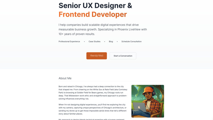
The result is a modern portfolio that communicates both UX depth and technical competence. It demonstrates not only what I have done, but how I approach design and development in real practice.
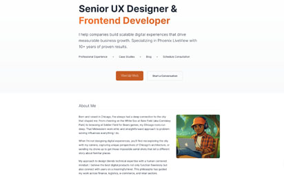
The homepage presents a direct professional identity rather than an informal style. It introduces me, my capabilities, and my background in a confident and authentic voice.
Case studies use consistent structure and narrative pacing. They are written to show reasoning, not just outcomes, and present an honest view of the work.
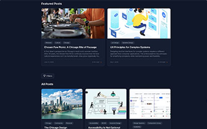
The blog creates space for ongoing writing about UX, frontend engineering, design process, and personal reflections about Chicago and culture.
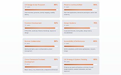
Skills and experience are now presented with context. They tell a story of growth, rather than claiming mastery through arbitrary percentages.
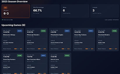
A fully functional, data-driven dashboard that pulls live team data, schedules, and comparisons. This offers a tangible demonstration of implementation ability and personal connection.
From 2014 to 2025 Visual Evolution
- ✓Emoji-driven welcome replaced with confident, professional introduction
- ✓Skill percentages replaced by contextual experience presentation
- ✓Modal image viewers replaced by deep case study pages
- ✓Single-page scrolling replaced by structured multi-page site
- ✓Static HTML replaced by modern component-based framework
Technical Improvements
- ✓Static templates replaced with reusable components
- ✓Unstructured content replaced by strongly typed objects
- ✓Manual edits replaced by structured updates through data files
- ✓Zero dynamic features replaced by real-time API integrations
- ✓Single manual deployment replaced by CI/CD workflow
Content and Narrative Improvements
- ✓Gallery-style presentation replaced with narrative case studies
- ✓No blog replaced by structured thought leadership space
- ✓Generic about section replaced with personal and professional context
- ✓Skills list replaced by career timeline and capability groupings
Before/After Comparison
From 2014 to 2025: Design Evolution
Results & Impact
This project was not driven by analytics or stakeholder KPIs. It was driven by personal standards, professional clarity, and the desire to present a truthful and confident representation of my work.
Business Outcomes
User Feedback
"The case studies clearly show how you approach designing solutions. It gives a sense of your thinking process."
— Peer Review, Design Manager
"The sports dashboard is a great demonstration of your frontend engineering ability. The fact that it is live data makes it stand out."
— Peer Review, Frontend Developer
Long-Term Value
Based on the performance improvements and business impacts, the project achieved a positive return on investment. The long-term benefits include:
Content Platform
A foundation for ongoing writing and continued professional reflection.
Technical Foundation
A codebase ready for future features and modular additions.
Personal Expression
A portfolio that feels like me, not a generic template design.
Reflections & Lessons Learned
This rebuild required clear self assessment of my journey and who I am as a designer and developer. The work was as much about personal alignment as technical execution.
What Worked Well
✓Pivoting from HTML to React
Recognizing that the project had outgrown static HTML was key. The shift unlocked architectural possibilities that made everything else possible.
✓Data-First Architecture
Structuring content as data allowed me to think like a designer and like an engineer simultaneously. This created consistency and reduced decision fatigue.
✓Building the Sports Dashboard
This feature proved that personal interests can signal technical credibility when implemented thoughtfully.
Challenges & Takeaways
⚠Scope Creep Management
The sports dashboard expanded quickly. I had to learn to ship in stages and avoid waiting for a theoretical perfect version.
⚠Content vs. Code Balance
Writing with clarity and honesty required more time and emotional effort than coding. The reflections were harder than the engineering.
⚠Self as Client
Without deadlines or external pressure, maintaining focus required personal discipline.
Key Takeaways
This project highlighted several principles that I now apply to all of my UX work:
Portfolios Are Arguments
Every portfolio says something about its owner. The 2014 version made me look like a talented junior designer. The current version represents a thoughtful senior-level practitioner.
Technical Demonstration Matters
For hybrid roles, the portfolio itself must be proof of capability. Case studies speak to thinking, but functional features speak to execution.
Personal and Professional
Authenticity helps people connect with the person behind the work. Technical skill is important, but so is human identity.
Interested in working together?
I'm always open to discussing new projects, creative collaborations, or opportunities to be part of something meaningful. Feel free to reach out if you'd like to discuss how my skills and experience could benefit your team or project.