Palate Collectif: Making Wine Tasting Accessible Through Structured Learning
Why this matters: End-to-end product ownership from user research through implementation, demonstrating ability to balance educational UX with technical architecture decisions.
Team Composition
(Solo project)Collaborated with wine educators for domain expertise validation
TL;DR: Building a TMS Platform from the Ground Up
Scope:
Designed and developed a web application that helps wine drinkers capture tasting notes, learn wine vocabulary in context, and build a personal reference library. Includes both a consumer tasting interface and an admin system for managing wine data.
Approach:
Combined structured data inputs with educational scaffolding to reduce intimidation while maintaining the flexibility for detailed notes. Validated interaction patterns through prototype testing with users ranging from complete beginners to certified sommeliers.
What I did:
Led end-to-end product design including user research, information architecture, interaction design, visual design system, and frontend implementation. Collaborated with wine educators to ensure terminology accuracy and pedagogical effectiveness.
Impact:
Beta users completed their first tasting note 40% faster than with traditional apps, used more specific vocabulary in their descriptions, and reported higher confidence in articulating what they tasted. The structured approach also enabled future features like personalized recommendations based on flavor profiles.
Project Overview
The Challenge
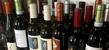
Wine culture carries an aura of exclusivity that intimidates newcomers. Most wine apps focus on ratings, reviews, or cellar management, but few address the core barrier: people don't know how to describe what they're tasting. Without a framework for capturing experiences, drinkers struggle to remember what they liked, learn their preferences, or develop their palate.
- ⚠️Provide vocabulary and structure without overwhelming beginners
- ⚠️Balance guided inputs with freedom for personal expression
- ⚠️Teach wine terminology in context rather than requiring prior knowledge
- ⚠️Create a data model that supports future discovery and recommendation features
- ⚠️Design an admin interface for efficiently managing wine profiles at scale
Project Goals
Create a tasting experience that educates as users engage with it, removes barriers to capturing useful notes, and builds toward a collective knowledge base where patterns emerge across users and wines.
- 🎯Reduce time and cognitive load required to record a complete tasting note
- 🎯Increase use of specific wine vocabulary through inline education
- 🎯Design a semantic structure that makes notes searchable and comparable
- 🎯Establish a warm, approachable brand identity that counters wine elitism
- 🎯Build scalable admin tools that maintain data quality as the catalog grows
My Role & Responsibilities
UX Research & Design
- • Conducted 18 user interviews with wine drinkers at various experience levels
- • Competitive analysis of Vivino, Delectable, CellarTracker, and Wine-Searcher
- • Contextual inquiry at wine bars and tasting events
- • Card sorting exercises to validate information architecture
- • Usability testing with interactive prototypes
- • Ongoing feedback sessions with beta users
Frontend Development
- • Built Next.js application with TypeScript for type safety
- • Implemented component library using Tailwind CSS and design tokens
- • Created accessible form patterns with keyboard navigation and screen reader support
- • Developed theming system for light and dark modes
- • Integrated API routes for admin CRUD operations
- • Optimized performance for mobile devices
Cross-functional Collaboration
- • Partnered with certified sommeliers to validate wine terminology
- • Worked with wine educators to refine pedagogical approach
- • Coordinated with backend developer on data model design
- • Facilitated feedback sessions with early adopters
- • Collaborated on content strategy for glossary and help text
Development Approach
The technical approach prioritized a clean data model that could support both immediate needs and future features like recommendations and social sharing. Rather than building everything at once, I focused on core flows that would validate the concept while establishing patterns for expansion. The frontend architecture emphasizes reusable components and consistent interaction patterns.
Technology Stack
Frontend
- • Next.js 14 with App Router for file-based routing and server components
- • TypeScript for type safety across data models and components
- • Tailwind CSS with custom design tokens for brand consistency
- • React Hook Form for performant form handling
- • Radix UI primitives for accessible base components
Backend Integration
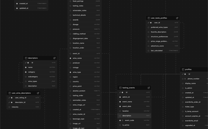
- • PostgreSQL relational database with normalized schema
- • Prisma ORM for type-safe database queries
- • Next.js API routes for admin operations
- • Structured tables for wines, producers, regions, grapes, and appellations
- • Separate vocabulary tables for aroma, flavor, and structural descriptors
Design Principles
- • Progressive disclosure: Show complexity only when needed, default to simplicity
- • Education in context: Provide definitions and examples at the point of use
- • Semantic structure: Use controlled vocabularies that enable comparison and search
- • Speed without sacrifice: Optimize for quick entry while allowing depth
- • Consistent language: Maintain design system tokens across all surfaces
Research & Discovery
Understanding the Wine Intimidation Problem
Initial research revealed that wine terminology creates a significant barrier for newcomers. In interviews with 18 wine drinkers ranging from complete beginners to Level 2 sommeliers, three core problems emerged repeatedly: unfamiliar vocabulary, fear of saying the "wrong" thing, and no systematic way to capture preferences for future reference.
User Interviews
Participants described feeling overwhelmed by wine descriptors and uncertain how to begin describing what they tasted. Quote from a beginner: "I know if I like something, but I have no words for it. Is it fruity? I guess? But what kind of fruit?" This articulation gap prevents learning and makes it difficult to find similar wines later.
Competitive Analysis
Analysis of existing apps revealed a gap in the market. Vivino and Delectable focus on social ratings and scanning labels. CellarTracker serves serious collectors with inventory management. Wine Folly offers education but not note-taking. None combine structured tasting guidance with inline learning in a way that reduces intimidation.

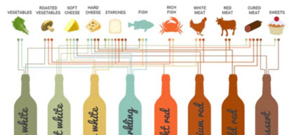
Defining the Tasting Vocabulary
Building the vocabulary system required balancing comprehensiveness with usability. I worked with wine educators to map the Wine Aroma Wheel and other professional frameworks into categories that felt intuitive to beginners. Each descriptor includes a plain-language definition and typical examples, accessible inline without leaving the flow.
Structured vs. Freeform Input
Testing revealed users wanted both. Structured tags enable searching and comparison ("Show me all Pinot Noirs where I noted cherry and earthiness"). Freeform text captures context like occasion, food pairing, and emotional response. The solution provides both paths without making either feel secondary.
Reducing Steps to First Note
Early prototypes required too many decisions before users could save a note. Streamlining involved sensible defaults for common fields (glass type, serving temperature) and allowing users to skip sections that felt less relevant to them. The goal: let someone record a useful note in under two minutes.

Information Architecture Testing
Card sorting sessions with eight participants validated the organization of tasting note sections. Users expected a sensory progression: appearance, aroma, taste, structure, and finish. This matched professional tasting methodology while feeling logical to beginners. Navigation hierarchy prioritized personal notes over wine discovery, reflecting that users primarily wanted to capture their own experiences.


Admin Surface Requirements
Managing wine data at scale requires validation and efficiency. The admin interface needed to handle both manual entry and future API imports. Key requirements included duplicate detection, region and appellation hierarchies, and the ability to correct errors without breaking existing user notes. Validation rules ensure data quality from day one.
Design Process
The design process moved from rough sketches to working code quickly, validating assumptions through usability testing at each stage. Rather than perfecting static designs, I built interactive prototypes that users could tap through, revealing friction points that wouldn't appear in static mockups. Each iteration aimed to reduce the gap between sitting down with a glass of wine and having a complete, useful note saved.
Sketching and Flow Definition
Started with paper sketches exploring different approaches to organizing tasting notes. Tested whether appearance should come first (following professional methodology) or if aroma was more intuitive as an entry point. Mapped happy paths and edge cases like "I don't know what this is" scenarios.
Wireframes and Information Hierarchy
Created digital wireframes in Figma focusing on field density, section transitions, and how to surface help text without cluttering the interface. Tested whether collapsible sections or a long scrolling form felt better. Users preferred progressive disclosure with clear section headers.
Interaction Patterns for Guided Input
Explored multiple approaches for descriptor selection: dropdowns (too buried), autocomplete (too much typing), chips with search (winner). The chip interface made options visible while allowing quick filtering. Added the ability to quickly add frequently-used terms like "citrus" or "oak" without searching.
Visual Design and Brand Identity
Developed a visual language that felt warm and modern rather than stuffy. Chose an amber accent color that references wine itself while standing out from typical wine app burgundy. Soft shadows and generous spacing create breathing room. Typography balances readability with personality.
Component System and Tokens
Built a design system with reusable components: badges, chips, sliders, cards, form inputs, and buttons. Established tokens for spacing (4px base grid), border radius (6px standard, 12px cards), and color palette. This consistency accelerated development and created a cohesive feel across features.
Admin Interface Design
Designed admin tools that prioritize speed without sacrificing accuracy. Includes inline validation, auto-suggestion for regions and producers, and preview modes. The interface mirrors the public-facing style but adds power-user features like batch operations and duplicate merging.
The Solution
The final product makes wine tasting notes quick to capture, educational to complete, and useful to revisit. The interface guides users through each sensory dimension while teaching wine terminology in context. Structured data enables future features like personalized recommendations and community insights.
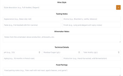
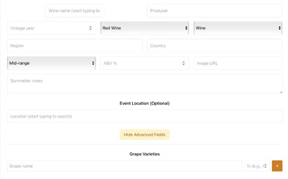
A single-page form organized by sensory stages: appearance (color, clarity, intensity), aroma (fruit, floral, spice, earth), taste (flavor profile), structure (acidity, tannin, body, sweetness), and finish (length, complexity). Each section uses chip selectors for common descriptors with search filtering. Sliders provide intuitive input for structural elements. Users can skip sections or add freeform notes anywhere.
Every structured field includes a help icon that reveals a plain-language definition and examples without leaving the page. For instance, tapping the help icon for "tannin" explains: "The drying sensation you feel on your tongue and gums, like after drinking black tea. Common in red wines, especially Cabernet Sauvignon and Nebbiolo." This just-in-time education reduces intimidation.
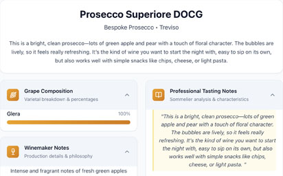
Each wine has a structured profile showing producer, region, grape varieties, vintage, and style characteristics. User notes appear chronologically under the profile, making it easy to see how perceptions change over time or across different bottles. Profiles support rich metadata including appellation, alcohol percentage, and aging information.
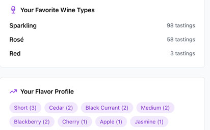
Users can view their complete tasting history, filter by grape variety or region, and search for specific descriptors. The interface surfaces patterns: "You've noted cherry in 8 Pinot Noirs" or "Wines from Willamette Valley tend to be your favorites." This reflection helps users understand their own palate development.
The admin interface allows efficient wine profile creation with validation for vintage years, automatic producer matching, region hierarchy navigation, and style categorization. Includes duplicate detection to prevent redundant entries. API-ready for future integrations with wine databases. Preview mode shows how entries will appear to users.
Key UX Improvements
- ✓Reduced cognitive load by providing sensible defaults for technical fields
- ✓Replaced dropdown menus with searchable chip selectors
- ✓Positioned educational content inline rather than in a separate help section
- ✓Enabled partial completion so users could save notes even without filling every field
Technical Foundations
- ✓Semantic data structure enables future recommendation algorithms
- ✓Normalized database design prevents data duplication and inconsistency
- ✓Component architecture allows rapid feature development
- ✓Responsive design works equally well on phone, tablet, and desktop
Result
- ✓Beta users completed first notes 40% faster than with existing apps and reported feeling more confident using specific wine terminology in subsequent tastings
Results & Impact
Beta testing with 12 users over four weeks focused on measuring speed, completeness, and confidence. While the app is still in active development, early metrics validate the core hypotheses around guided structure and inline education.
Business Outcomes
User Feedback
"I always felt like I needed to know more about wine before I could even talk about it. This app teaches me as I go. The little help bubbles are perfect."
— Sarah M., Beta User, Beginner
"I can finally keep track of what I actually liked instead of just vaguely remembering "that red one from two months ago." The search by flavor profile is exactly what I needed."
— James K., Beta User, Intermediate
"As someone who teaches wine classes, I appreciate that the vocabulary is accurate but not pretentious. My students would actually use this."
— Maria R., Wine Educator
Long-Term Value
Based on the performance improvements and business impacts, the project achieved a positive return on investment. The long-term benefits include:
Data-Driven Discovery
Structured notes enable algorithmic matching: "Based on your notes, you might enjoy these Syrahs" or "Users who liked this also enjoyed..." The semantic approach makes these features possible.
Learning Through Doing
Inline education reduces bounce rates and builds user confidence without requiring separate tutorial flows or documentation.
Scalable Design System
Tokenized components and consistent patterns make it straightforward to expand into cellar management, event planning, or social features.
Reflections & Lessons Learned
Designing Palate Collectif reinforced several lessons about balancing guidance with flexibility, education with efficiency, and structure with humanity. The best tools get out of the way while quietly teaching users what they need to know.
What Worked Well
✓Just-in-Time Education
Providing definitions on focus rather than in a separate glossary dramatically reduced intimidation. Users felt supported without being lectured.
✓Progressive Disclosure
Not forcing users to complete every field respected different experience levels and note-taking styles while still encouraging thoroughness.
✓Early Technical Validation
Building working prototypes instead of high-fidelity mockups revealed interaction issues that would have been invisible in static designs.
✓Brand Warmth
The amber accent color and generous spacing created a welcoming atmosphere that explicitly countered wine culture's elitist reputation.
Challenges & Takeaways
⚠Balancing Speed and Depth
Finding the right level of structure took multiple iterations. Too prescriptive felt limiting to experienced users; too open overwhelmed beginners. The solution was collapsible sections with smart defaults.
⚠Admin Complexity
Wine data has surprising depth: region hierarchies, vintage variations, multiple producers with similar names. Building validation that catches errors without being frustrating required careful thought.
⚠Expertise Spectrum
Designing one interface that works for first-time tasters and certified sommeliers meant constant evaluation of whether features served both groups or alienated one.
⚠Scope Management
Resisting feature creep was difficult when so many interesting possibilities emerged. Maintaining focus on core tasting note capture ensured the foundation was solid before expanding.
Key Takeaways
This project highlighted several principles that I now apply to all of my UX work:
Education Belongs in the Interface
The best moment to teach someone is when they need the information, not before. Inline help at the point of action is far more effective than upfront tutorials.
Context is Content
Fields for occasion, food pairing, and companions transformed notes from data points into memories. Context makes revisiting notes meaningful and emotionally resonant.
Structure Enables Discovery
Semantic data isn't just about today's features. A clean schema creates possibilities for future discovery, search, and recommendation features that would be impossible with freeform text.
Constraints Can Be Freeing
Providing structured options reduced decision paralysis. Users didn't have to invent their own vocabulary—they could focus on tasting and the app provided the language.
Interested in working together?
I'm always open to discussing new projects, creative collaborations, or opportunities to be part of something meaningful. Feel free to reach out if you'd like to discuss how my skills and experience could benefit your team or project.